Verisk ISO
Check out all the different projects I got to work on during my time at Verisk.
At Verisk ISO, I was able to participate in many different projects that all tested my User Experience skills. With it being my first professional job, I learned a great deal about how to work in a corporate setting and add value to a company. Under the mentorship of ISO’s Lead Experience Designer and Researcher (Craig Bachman), I was able to hone and progress my abilities as both a researcher and designer. I learned from my mistakes and figured out how to go above and beyond when working in a UX team. Below you will find a breakdown of the work I did during my time at ISO.
Verisk Projects
-
The first project I completed at Verisk ISO was to create a Design Pattern Library (DPL). The purpose of the DPL was to serve as a resource for designers and developers at Verisk to use when creating products or branding elements. The DPL is part of a UX revolution that the company is currently undergoing – it allows designers to be consistent in their designs and gives developers a reference to make sure that all elements on every page are uniform. The DPL allows ISO employees to be good stewards of the brand and create a continuous and consistent experience for their users.
I divided the DPL into two sections: branding and patterns. The branding section of the library contains four pages: Colors, Icons, Logos, and Typography.
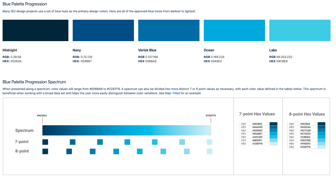
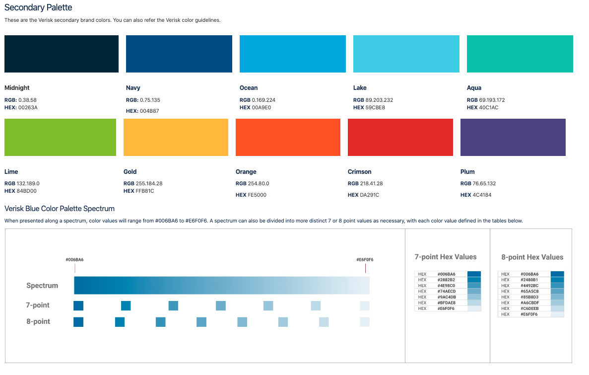 The Colors page presents all of the different palettes that are in use at ISO and also gives information on when and how to use them. This is a page that I used very often to ensure that my later designs had the appropriate colors and also to find new possible colors that I could use. Here is an example of two palettes.
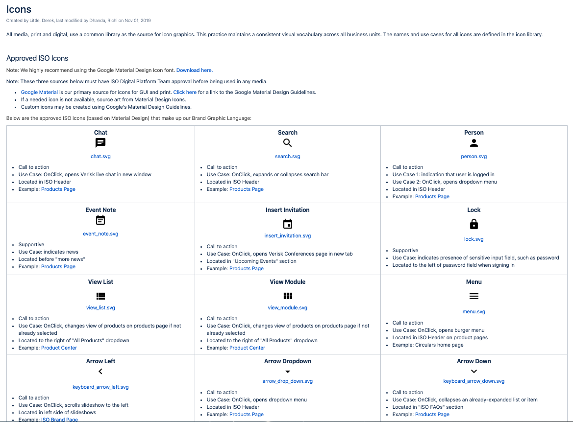
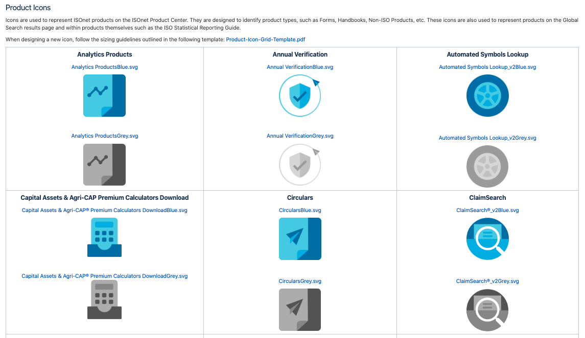
 The Icons page presents an inventory of all of the icons that are in use or upcoming on the ISO platform. To create this page, I had to take inventory of the entire platform and make sure that every single icon and its location were recorded. I put these icons into tables that allowed users of the library to download SVGs and find live examples of their use. This page also allowed us, the UX team, to critique the icons that were in use; they were implemented long ago by a team that is no longer at the company, so many of them were either confusing or inappropriate. We were able to make many positive changes that made the icons more consistent and understandable. I also provided a template guide for designers to create new icons.
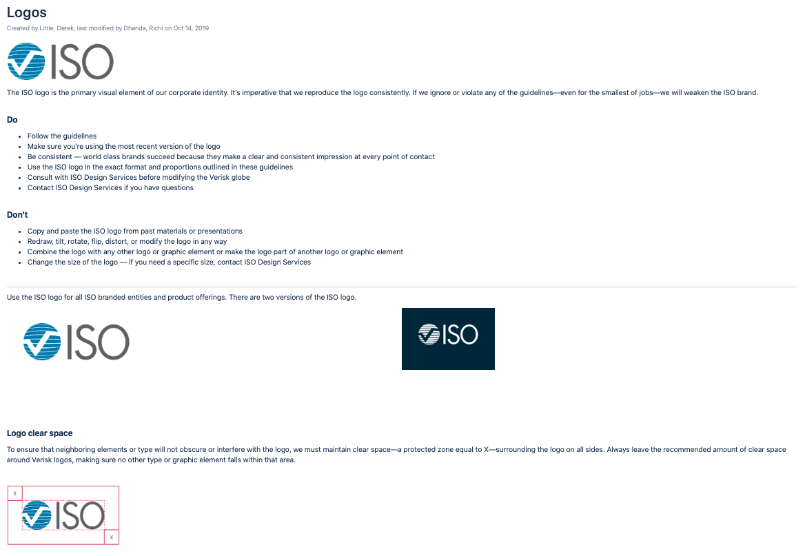
The Logos page presents all of the different ISO logos that our designers and developers can use, along with a list of do’s and don’ts regarding logos.
The Typography page was simply a visualization of the fonts that are in use and our range of appropriate font-weights.
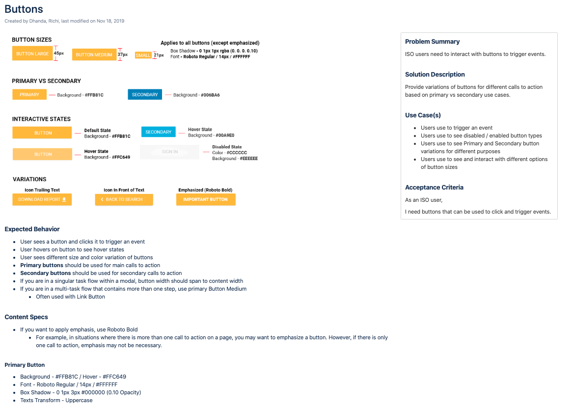
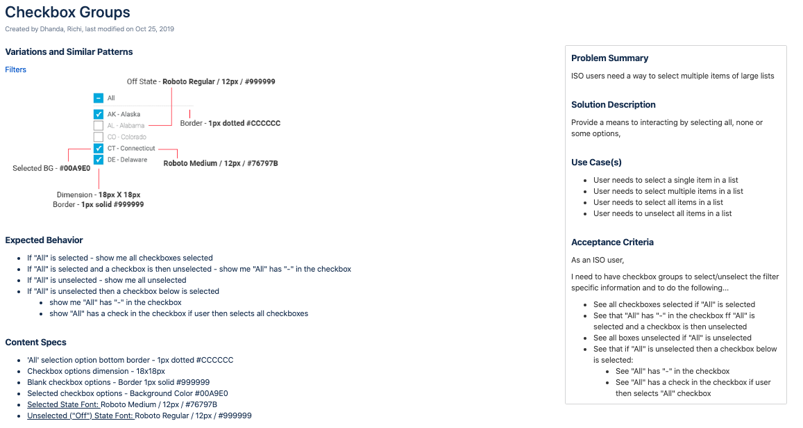
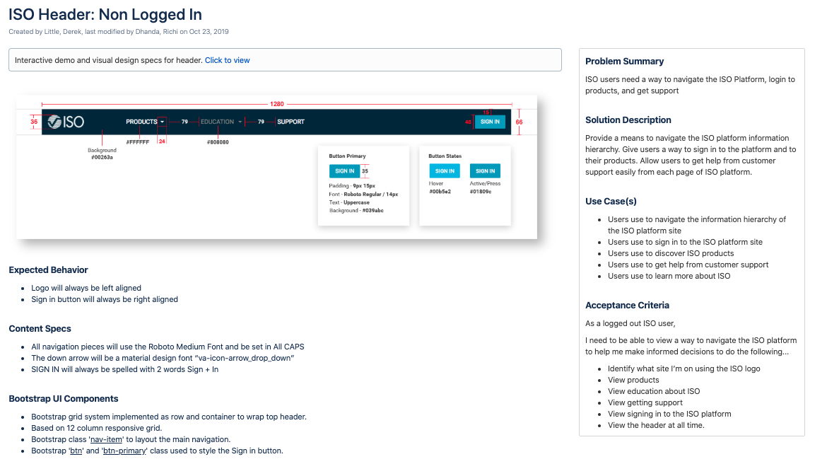
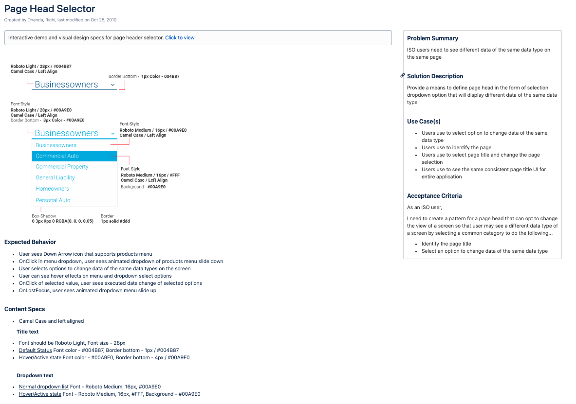
The patterns section of the library is where the bulk of my work shows. For this section, I identified all of the different design patterns in use on the ISO platform along with upcoming patterns in our prototypes. At ISO, we defined design patterns as solutions to commonly occurring problems that we faced in our designs. There is no defined scope for how big or small a pattern can be; patterns can even contain other patterns. For example, the header and footer can each be a pattern, but the button housed in the header is also its own pattern. Each pattern page contains four distinct elements: a visualization, the expected behavior, the content specs, and a sidebar that outlines the problem, its solution, its use cases, and its acceptance criteria. Some pattern pages contained additional elements if they were available, such as an interactive demo and/or bootstrap UI components. I created pattern pages for every part of the page hierarchy, from the header to the footer and everything in between on the ISO platform. Below are some examples of different pattern pages that I created.
-
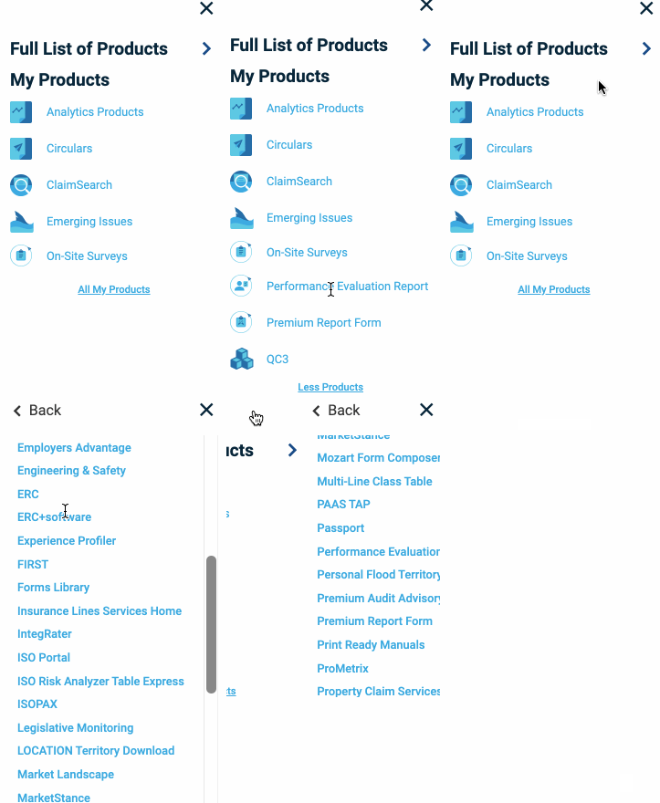
One large issue that the ISO platform faces is that it is not designed for mobile views. If one were to open the ISO product menu on their phone, they would only see a very small amount of the 50+ products that are being offered. As ISO looks to modernize and improve their overall user experience, we knew that we needed to redesign this very important menu so that it was viable for mobile users.
In designing this menu, I prioritized the ability for users to quickly see and navigate to the products that they were already subscribed to. The user first sees the option to view the full list of products, followed by an expandable list of their own products. This orientation gives the user more space to explore “My Products.” I envisioned that the user wanting to see the full list of products would be a very small use case; if our users truly wanted to explore a new product and whether they should subscribe to it, they would not be doing so on a mobile phone. Mobile users are more concerned with checking in on their own products and data rather than sifting for information about a new and expensive product. See the GIF below for a visualization of the design.
-
One issue that ISO is trying to solve is working to get their users to engage more with their content. They release articles and press releases that they want their users to read but there is not much traffic on the website outside of the products. Users usually bookmark their product pages, do what they need to in their products, and get out of ISO as quickly as possible.
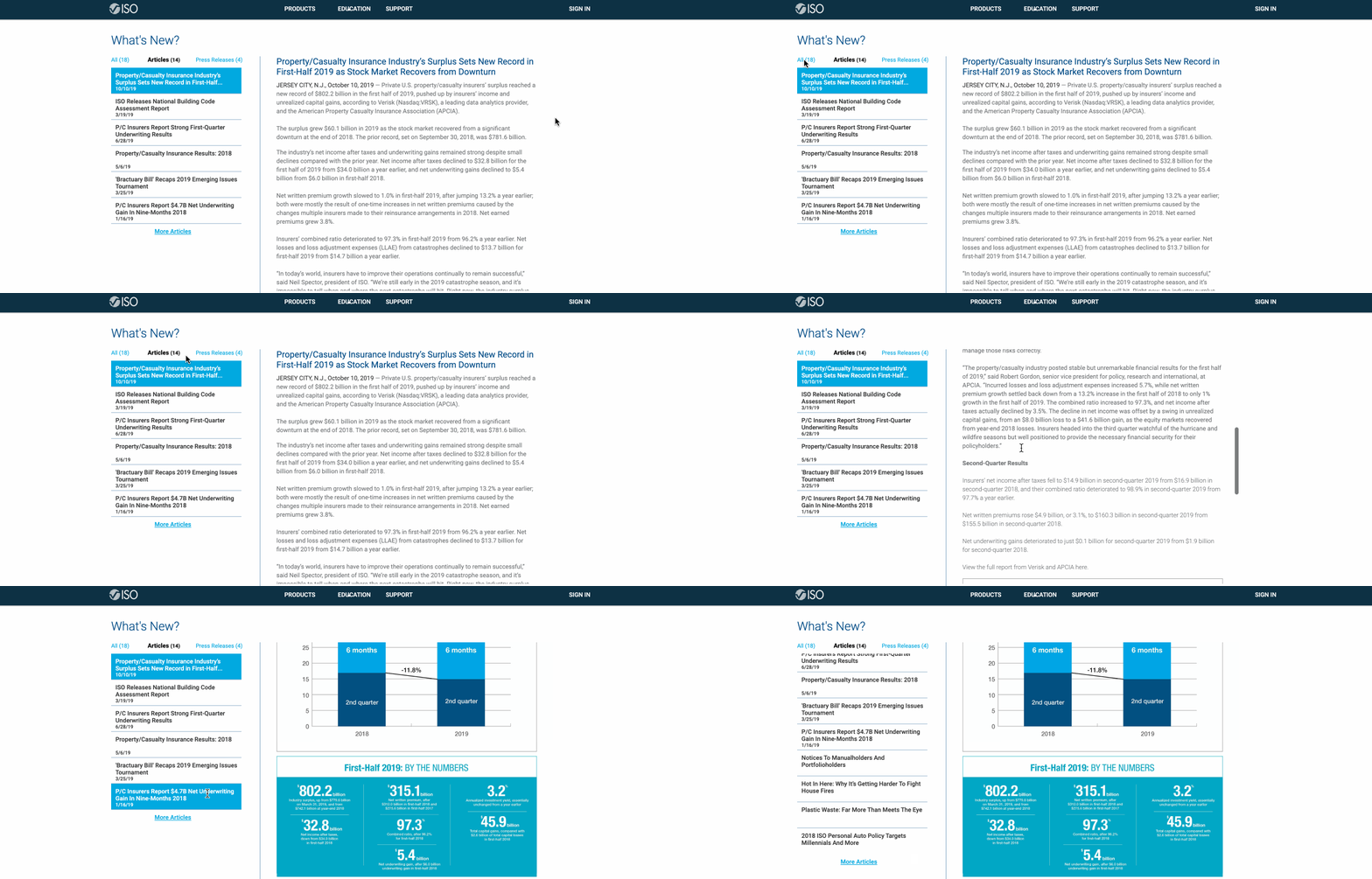
One reason this happens is because the content that is provided is not presented in a very user-friendly fashion. On the home page, there is a panel of two recent articles and a link that takes you to a page with all of the articles listed in a collapsed accordion. It takes no less than three clicks to eventually get to the article itself, and on top of that it takes you away from the ISO platform. Additionally, the page that has the accordion of all the article links is very confusing and non-intuitive.
My goal when designing a new solution for ISO Articles was to reduce the number of clicks it takes for a user to get to the content; it should not take more than one click for the user to be able to read what they are looking for. Additionally, I wanted to design a solution that keeps the user on the ISO platform and makes it easy for them to consume multiple articles in one session.
Unfortunately, I did not get to iterate on this design as much as I wanted to because it was started towards the end of my contract. I was able to get feedback on my designs from the rest of the team once before making improvements and handing it off when I completed my contract. Below is a visualization of the young design.
-
The last project I participated in before leaving ISO was to ideate and create wireframes for a redesign of all of ISOnet. As stated previously in the ISO Articles section, ISO has an issue where their users do not engage with their website and platform as much as they want them to; they simply come for the products and leave as quickly as possible with whatever data or information they need.
The UX team at ISO took it upon themselves to try and completely rethink how the ISO platform works. I was specifically tasked with working on ideas for what the logged-out version of the website would look like. Currently, both the logged-out and logged-in versions of the ISO home page look almost identical. We thought this was a serious issue because those should be very different pages; the logged-out version of a home page needs to accomplish completely different goals than the logged-in version.
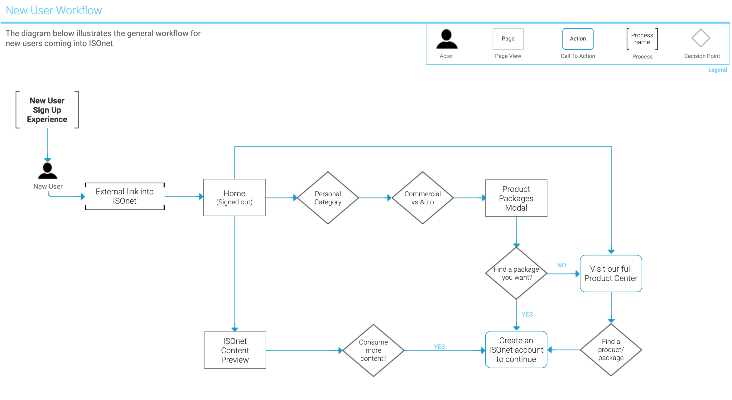
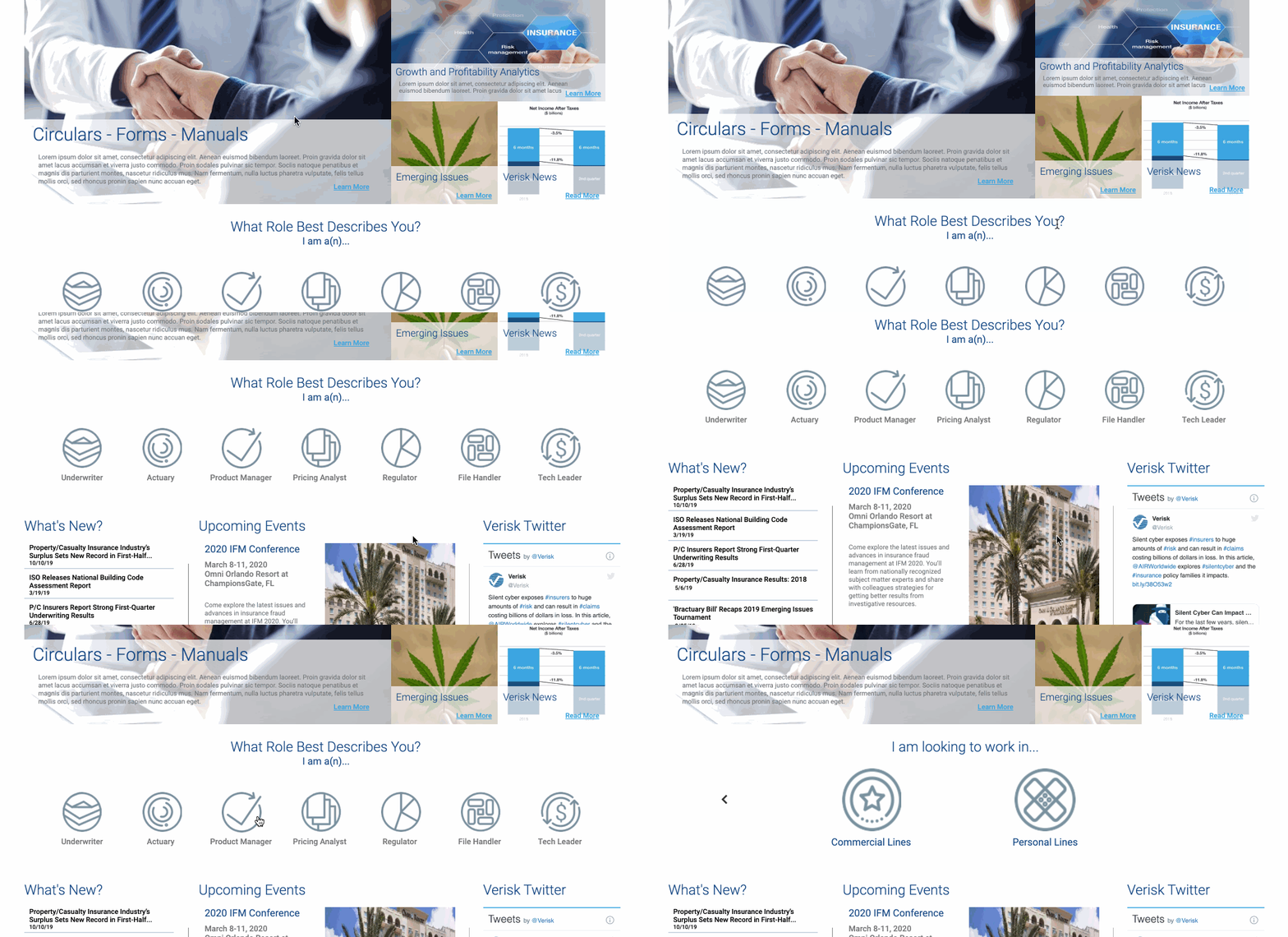
In ideating and designing wireframes for the logged-out version, I decided that the main goal of this page was to get users to create an account with ISO and buy products. The current method of signing up for an ISO product or account is very complicated and involves scheduling and talking with sales representatives. Users should be able to sign up for ISO products on their own straight from the website without the assistance of an employee.
I only had one week to work on this project before the end of my contract, so I was only able to come up with the initial stages of the designs. I created a workflow diagram for the new process for users to sign up for products and created wireframes for what the new logged-out home page could look like. After getting inspired from different company sites that sell digital products, I proposed a design that utilized machine learning to offer new users the best and most relevant packages for them. You can find the workflow diagram and a visualization of the young design below.
-
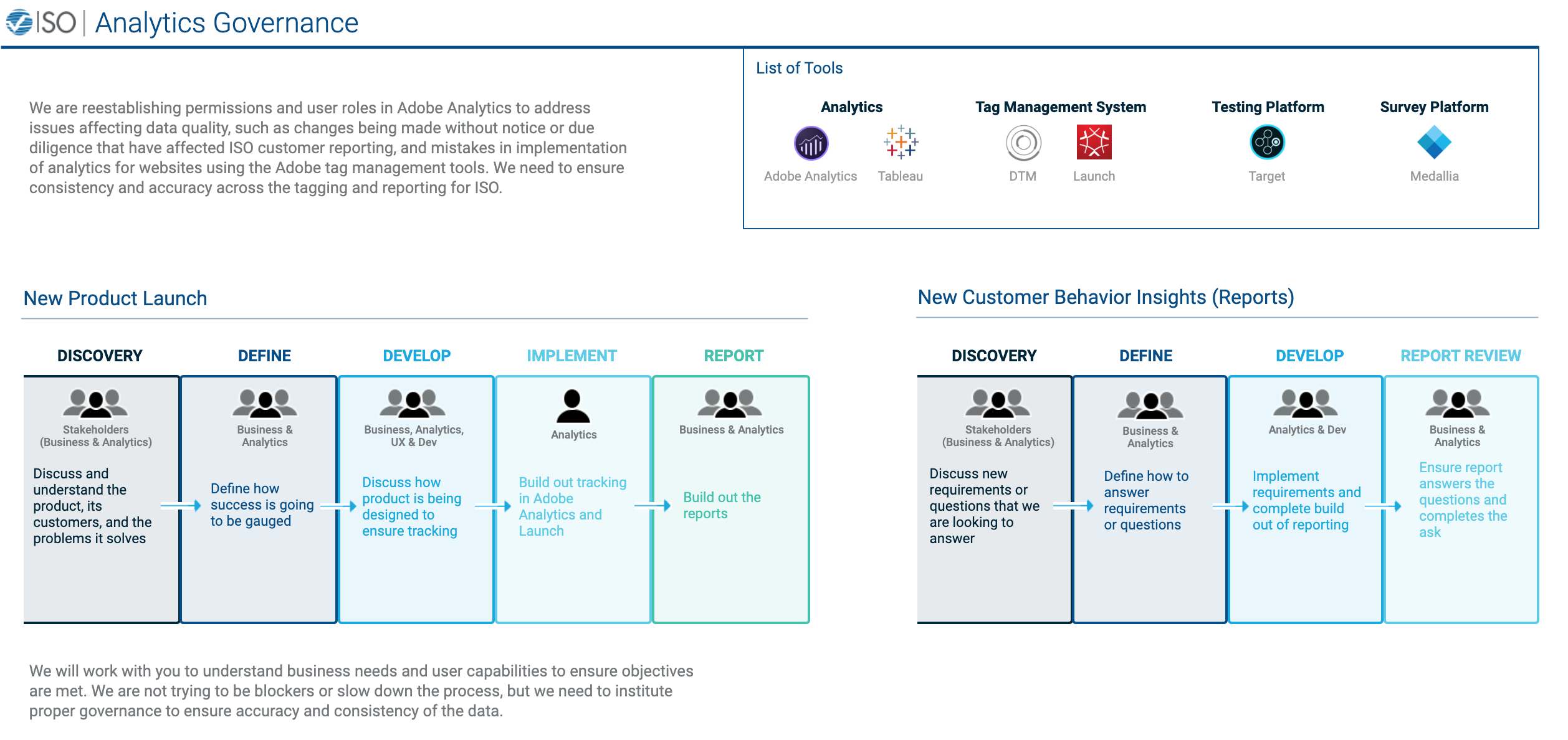
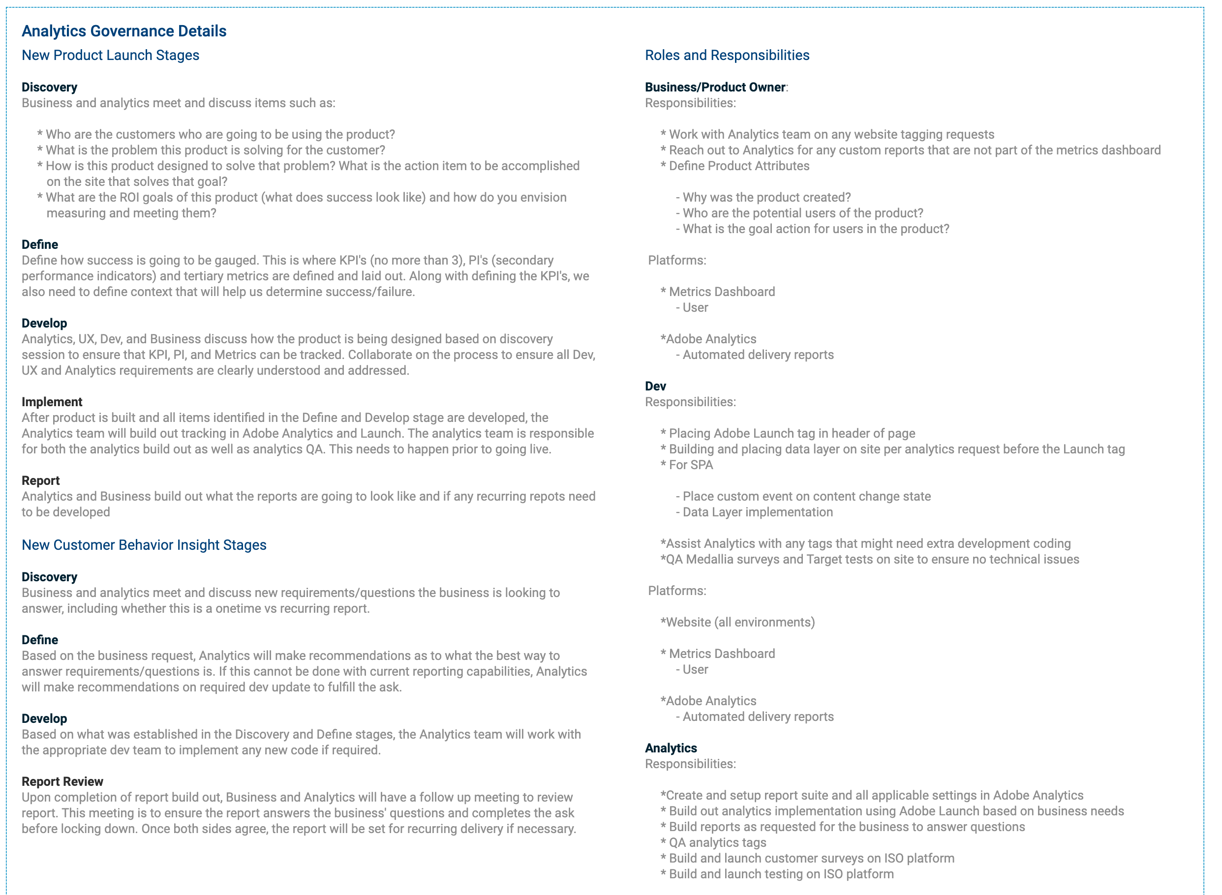
The UX team at ISO was periodically asked to make visualization documents for specific teams or purposes. One document that I was tasked with creating was a document that outlines Analytics Governance at the company. This document would provide ISO employees with information on how to engage with the Analytics team for whatever purpose they needed, whether that be setting up analytics on their products or using the proper analytics tools for projects. The Analytics team felt that employees were engaging them in ways that were either confusing or did not lead to the best results. For example, changes were being made without informing the team, or mistakes were being made when trying to implement analytics tools onto a product.
I was given basic information on the processes that they wanted to highlight, and also given information on the different roles involved in these processes and the tools in use. With all that information, I had to package it into something that was easy to consume but also detailed enough to prevent further mistakes.
Due to the large amount of information I had to put into this document, I divided it into two sections. The top half of the document was the simple visualization that employees would likely be referring to most to remind themselves of the processes and roles involved. The bottom half of the document was where one could find all of the finer details if they needed them. You can see both halves below.
-
With many new products in the pipeline, ISO needed to design a solution for teaching their users how to use their new products, especially because they are going to be drastically different from the antiquated designs of the current products. The demographic of ISO users leans toward the older side; these are people that have been working in the insurance industry for decades using the same Verisk ISO products to get their jobs done. We recognized that while we are improving our products and the overall experience for our users, these innovations also represent change which is often seen unfavorably by those who are comfortable in their routines. Currently, if an ISO user needs help with how to use a product, they can either sift through Help PDFs that are provided on the website or they can contact a customer service representative. Both of these options are undesirable; they require too much time to provide little amounts of information. Therefore, I was tasked with designing a help solution for the product that was closest to launch: FLV. FLV is a filing lifecycle viewer that allows users to see and sort through filings along their timeline of approval.
The first step in my process was to put all of the different ideas I had for this on paper. I created a series of paper prototypes that all addressed the problem differently or addressed different aspects of the problem. This allowed me to meet with the UX team to discuss all the pros and cons of my designs. We ultimately decided on the final design because we felt it was a good blend of contextual and urgent without being too intrusive on the user’s experience.
The first thing that the user sees when opening FLV is a search modal. I knew that I needed to provide the help before the user interacted with anything in order to make sure they knew what they were doing. I designed this solution so that it takes over the modal when the user opens the product for the first time. On any subsequent visit, the help tutorial would not take over the modal but would still be available to use. The user goes through the tutorial steps, hits “Got It” and the help modal slides up to reveal the search modal. This solution ensures that the user interacts with the tutorial and also allows them to revisit it any point during their use of the product if they forget something.
Unfortunately I cannot show the visualization of this design due to it being proprietary.
-
One project that a colleague of mine on the UX team at ISO was working on was a new search capability called Consolidated Loss Costs Download. This product was a simple search form that allowed users to directly download data that they previously had to extract themselves from large PDFs. Additionally, the form allowed users to choose data by state, line of business, and month.
I had helped my colleague throughout her design process by providing feedback and ideas, so I was very ready for writing the script for user testing. Along with my colleague, I outlined all of the different scenarios that we needed to test and helped write the script. We were able to find 6 participants for our user testing sessions. I participated in the testing sessions along with the rest of the team and we were able to extract many valuable pieces of information that were going to help inform the final design of CLCD.