Tompkins County Science Hub
A central hub for parents and children to find educational programs in Tompkins County.
Prototyping and User Testing
WIreframes with Sketch
After receiving input from our interviews, we went ahead and created our first set of wireframes using Sketch. We wanted to establish the basic look and functionality of our website through these wireframes. We created a page for the organization search and a page for the program search.
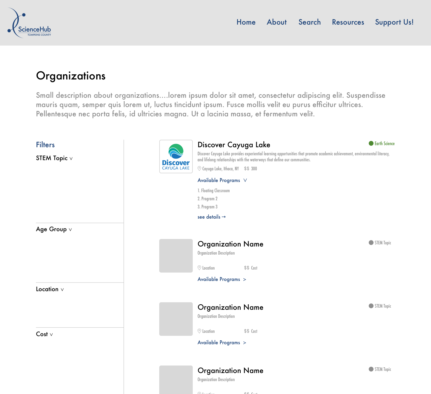
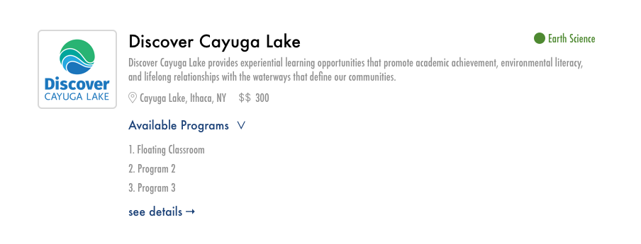
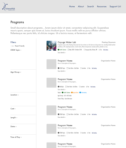
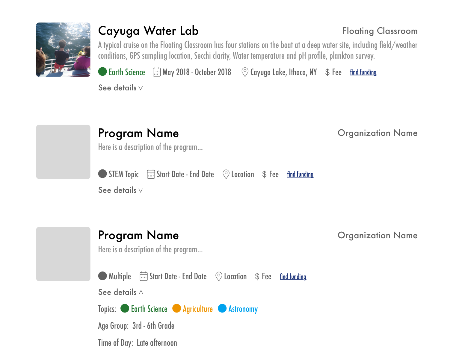
We sent these wireframes to our interviewees to get their feedback because they were not available to meet and we did not have enough time to wait before continuing our process. We received positive feedback: they believed the designs to be “easy to look at” and “not confusing.” The only criticism we received was that they would have enjoyed more color on the page, but we weren’t working on the styling of the website yet so we moved forward to build our first interactive prototype.
Interactive Javascript Prototype
Our next goal was to create an interactive prototype. We teamed up with a programmer from CCE (Cornell Cooperative Extension) to help us code because our small team of two would not have been able to finish this in time as the internship was unfortunately almost over. We coded in javascript and used Amazon Web Services. We had the following goals for producing this prototype:
- Establish the navigational structure of the site. In our many meetings where we brainstormed what the website would look like, we experienced a lot of conflict over what pages to include. One of the main arguments was about whether organizations needed their own pages, or if the website should only highlight programs. We ended up including both the organization search page and the program search page.
- Establish our filter system. We needed to include our full list of filters to search by because they were the main functionality of the site. We did not have plans to include a keyword search, so our filters had to be robust enough to account for every factor that our users would consider when making a choice.
If you would like to interact with this prototype yourself, you can do so by clicking here.
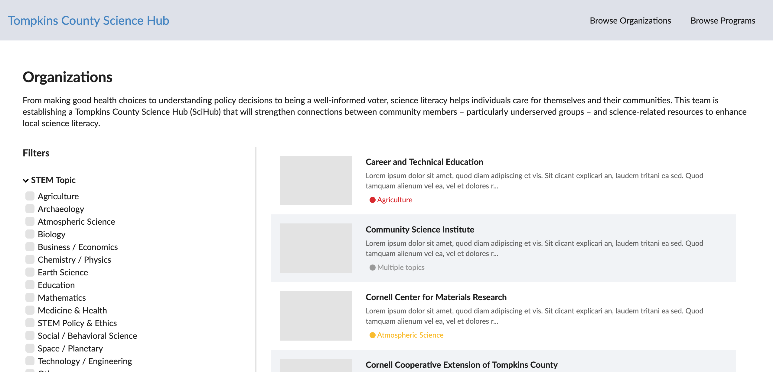
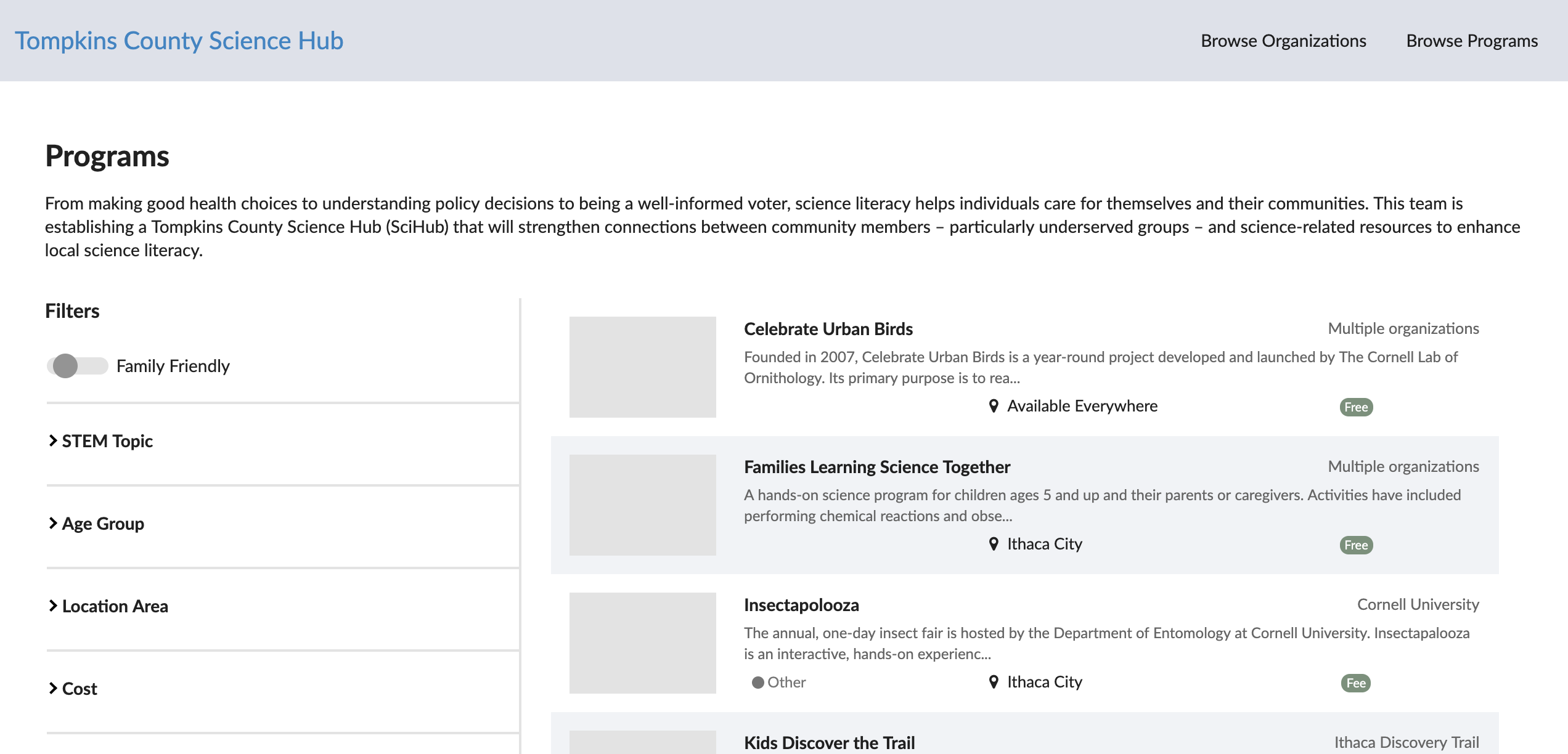
As mentioned earlier, the internship was coming to a close soon after we created our interactive prototype, so we unfortunately did not get to conduct the user testing for it. Tompkins County Science Hub is still under development, with a targeted launch date in mid-to-late 2019.
Takeaways
Being a part of this project was a great experience for myself. The relationships I gained and the people I met truly convinced me that I wanted to have a career in User Experience where I solved problems cooperatively. It was very special to be such an integral part of a project that will benefit the community that I had come to love over my four years at Cornell. Participating in the initial brainstorming and ideation of the website and what it’s purpose and functionality would be gave me a lot of confidence in my decision making skills and taught me the importance of iteration and communication when designing something. I am very excited for TCSH to launch and can’t wait to see how much the community appreciates and benefits from it.