Track That
A versatile solution for all your tracking needs.
Prototyping and User Testing
Paper Prototype

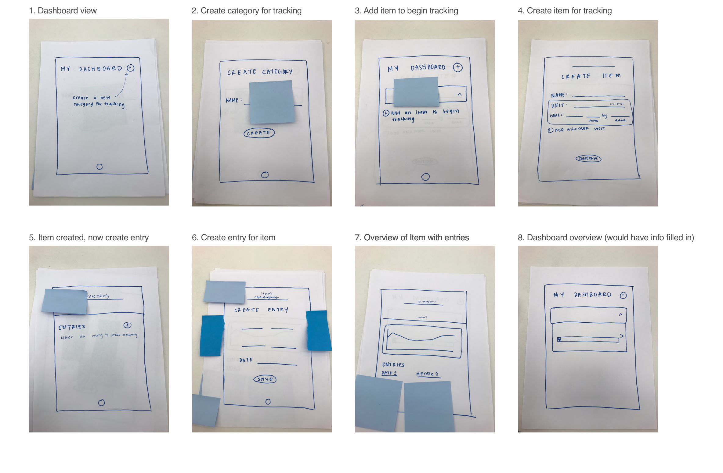
We tested our paper prototype with five people from our target group. After testing, we found we needed to:
- Improve the language of our app.
- Our language of “categories” and “items” were ambiguous and our users were not sure what to input.
- The conversational style of our application was too robotic/formal.
- Add more navigational buttons, like “back” and “edit” buttons.
- Make the flow less heavy.
- Users felt it took too many clicks to input tracking. They had to create a category, create an item, and then an entry.
We also learned that users did not care that much about creating goals. They were satisfied with tracking progress and inputting data, but creating goals to meet were not as important.
Wireframes

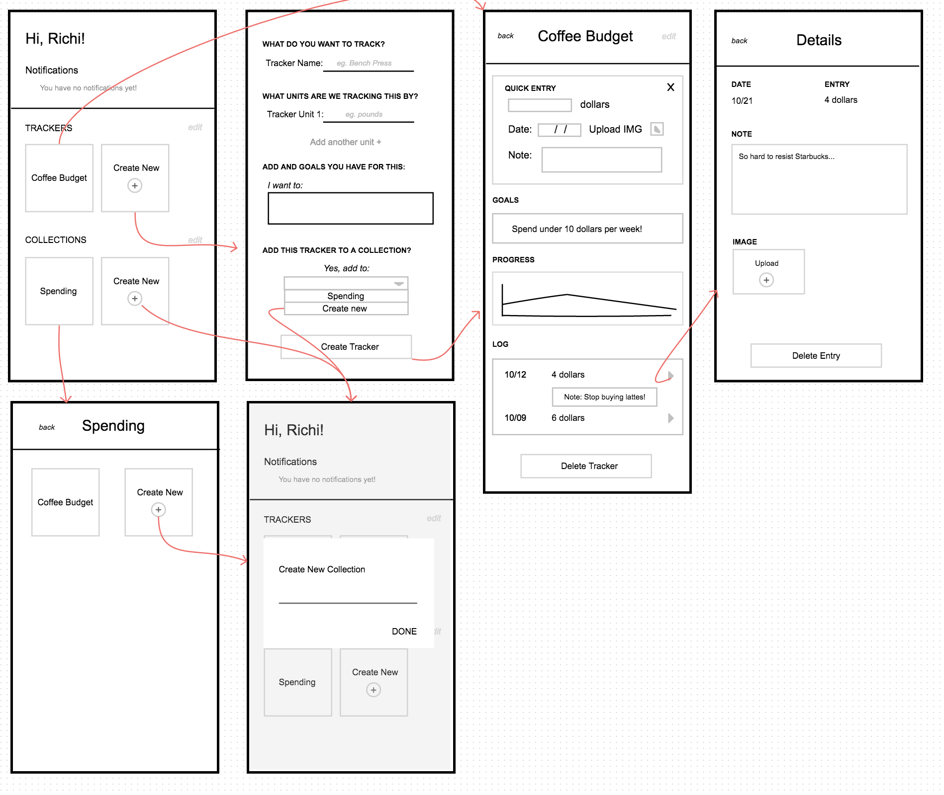
After user research and interface iterations, we decided on a flow that both utilizes friendly human language and reduces the number of steps necessary for functionaltiy. Specifically, we:
- Put all primary components visible at once on a dashboard, reducing the number of clicks/taps necessary to start tracking.
- We came to this format by paralleling the tracking to Google Drive, where “Collections” are folders and “Trackers” are files.
- Initially, a user would be required to create a “category” in order to create an “item”. For example, they would have to create a larger category of “Fitness” to track “weight.” We de-coupled this so that user can create “Trackers” without necessarily creating a “Collection,” but can add to a collection if they choose.
- Created a conversation between the user and interface.
- Instead of generic and robotic labels that would confuse the user, we ask the user questions to create trackers and input information.
- We tried to ask questions in our language, like “What do you want to track?” instead of just telling the user what to do to enforce that conversational tone.
- Simplified the information display.
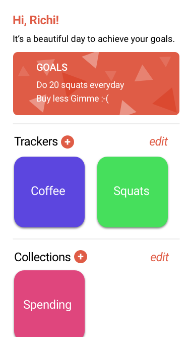
- Throughout the planning process, we found ourselves straying away from the MVP and adding unnecessary features. We were trying to figure out how to add a “goals” feature, but when thinking back to our users, none of our users specified that they wanted to track goals. They wanted to focus on progress. To meet our value propositions, we changed the “goals” feature from a numerical calculation to a simple notification with text that they could modify themselves and look at for moral support.
High Fidelity Prototype

Implementation and Deployment
Track That is a progressive web app. As a team, we used the Vue framework to build our app, and Github for version control. All members of our team were involved in both the technical and design aspects of the code.
You can test out the app yourself and start tracking today: https://track-dat.herokuapp.com/
After deploying Track That, we conducted our final rounds of user testing. Overall, we had positive responses to our application design and a lot of design decisions were validated through user testing. None of the users from our target audiences had major issues with the flow of our application, but there were small fixes that we recognized could help increase the user experience. We made the following final improvements:
- Fixing delete entry: we found a small bug during testing, in which our entries would not accurately delete and fixed the bug.
- Reduce header size: Feedback included reducing header size. We also noticed in testing that the text took a lot of space on the screen and would prevent users from seeing content at the bottom.
- Indicate required fields: in user testing, some users did not know which fields were required or optional. Our application does require some fields and so we indicated those with a *.
- Placeholder fields: for users that might not be sure what value to enter in certain fields, adding placeholder text will help them understand the purpose of the input without being intrusive.
- Make graph functionality more clear: for successful graph functionality, our application requires that at least two entries are made on two separate dates. We did not make this direction clear and as a result, users were getting confused when the graph did not show.
- Add “create collection” button: by adding a create collection button in the ‘create tracker flow,’ users use less clicks to organize their data.
- Clarify deleting a collection: previously, users were confused how their trackers would be affected by deleting a collection. We added wording on the ‘delete collection popup’ to clarify trackers would not be affected.
Takeaways
Completing this project was a huge step for me because it was the first time that I was fully involved in every step of the process of creating a product. From researching, to prototyping, to user testing, to implementation, this project tested and improved all of my User Experience and technical skills. One thing that I was particularly proud of was that I got to use and improve my coding skills. Creating an app from the bottom-up without any assistance was a really daunting task, but upon completion I realized that it was not as difficult as I expected and that I should have more confidence in my technical abilities. A final plus from this project was that I now have a tracking app of my own that I will be using constantly!