recruit.me
A solution to help college organizations recruit members.
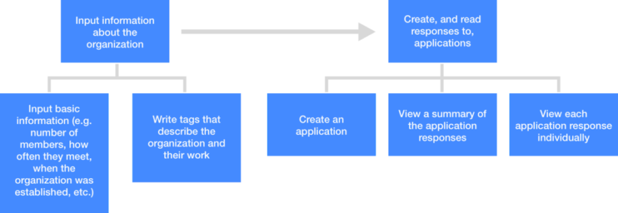
UI Sketches
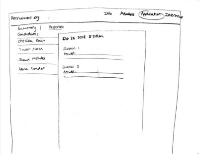
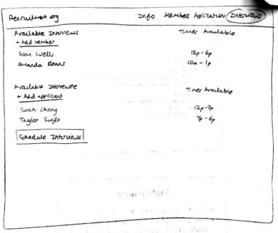
After defining our tasks, we created our first set of rough UI sketches:
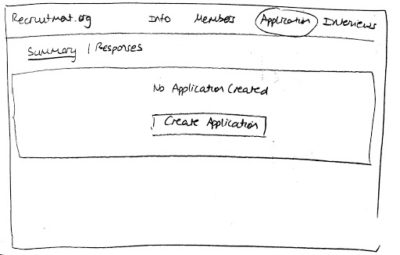
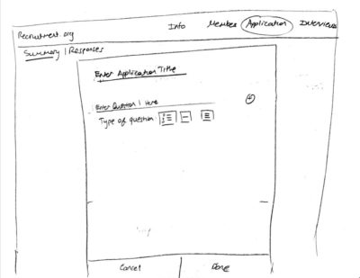
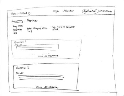
Paper Prototype
After agreeing on the basic structure of our design, we went ahead and created our paper prototype so that we could conduct user testing and further iron out our design.
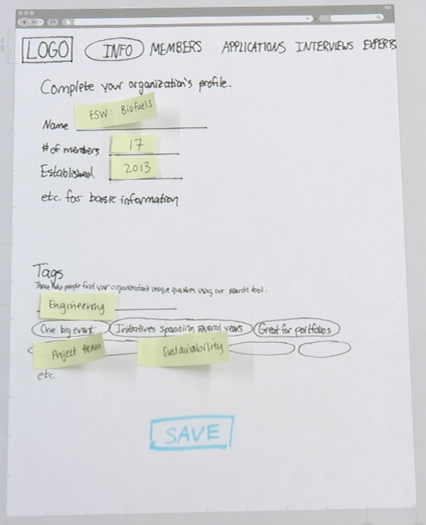
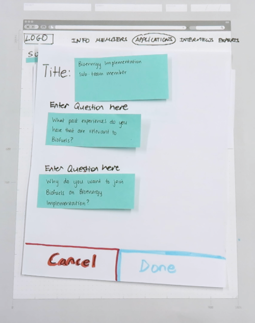
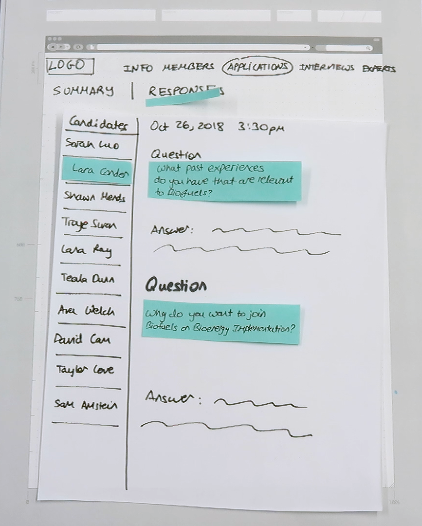
We conducted three more interviews with new organization leads to get some feedback on our first paper prototype. We received mostly positive feedback on our navigational structure; our interviewees felt it was easy to understand and use. The criticism we received was that that the application and interview pages did not look like they had much functionality, so we knew we had to make those pages more robust in order for users to be attracted to the app.
Mid-fidelity Prototype with Balsamiq
We created our next prototype using Balsamiq. You can interact with it directly by clicking here.
We used the feedback from our user testing interviews to incorporate the following design choices:
- A horizontal navigation bar is implemented to enable a logical and clear navigation structure of the site — the logo is on the very left while the navigation tabs read from left to right, thus following the natural mapping of the Western cultural and English language conventions
-
The prototype focuses on utilizing visibility principles to draw and direct the attention of users, such as adding in standardized icons like the location icon on page 21. Rectangular boxes and lines are also frequently utilized to separate different sections on the page in order to create basic structure of the site’s layout, so the user would easily separate different elements visually
-
There are many alternative ways to display information on the screen — such as dropdown lists. However, the prototype utilizes a listed display of clickable names (such as page 11). We intend for the visibility of the site to be as straightforward as possible. Furthermore, we also utilize input boxes instead of other input options such as radio buttons and checkboxes due to the desirable flexibility we wish to grant the organization leaders
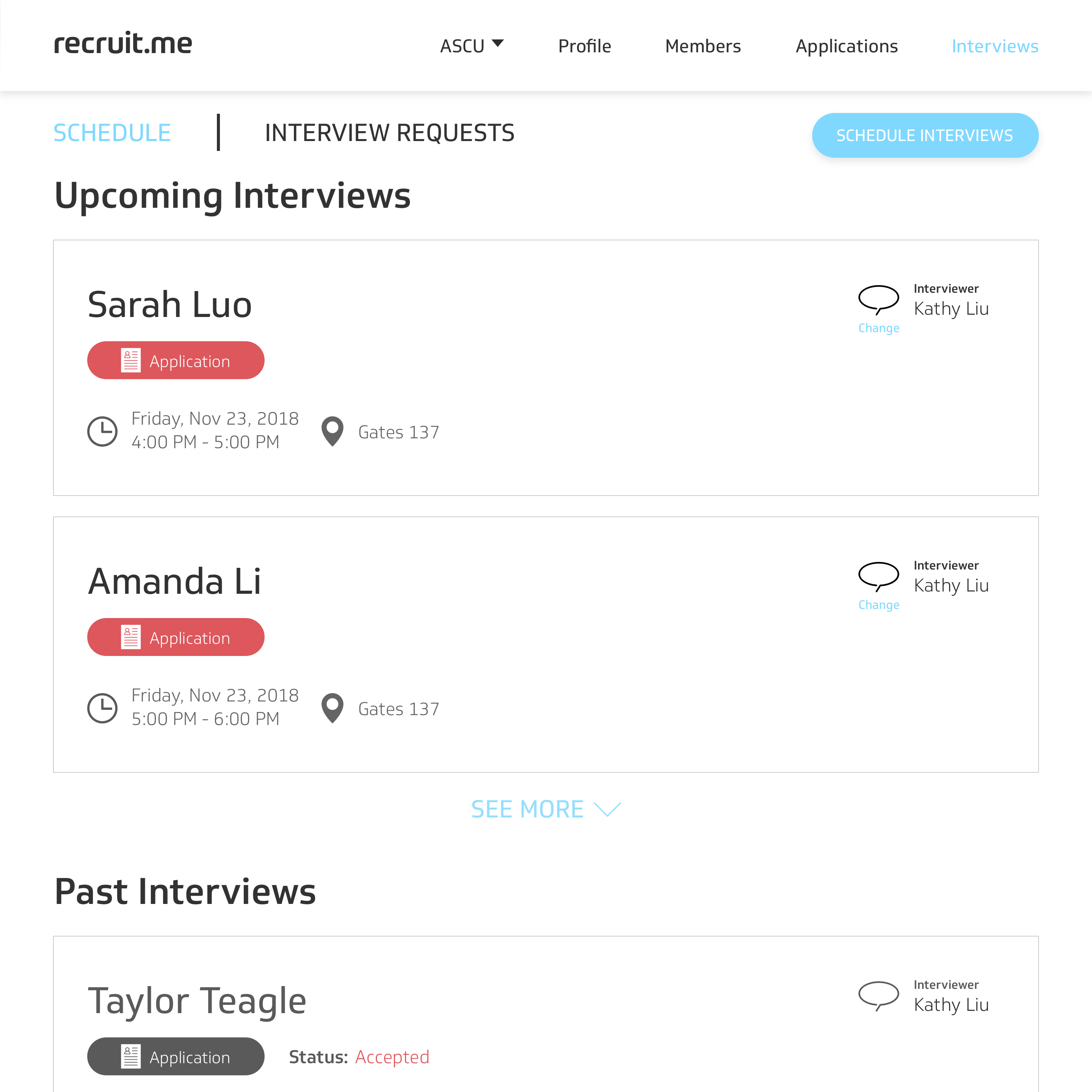
- To increase the robustness of the application and interview pages, we added features such as messaging in the application page, interview scheduling, and a search by tag function on the organization member page
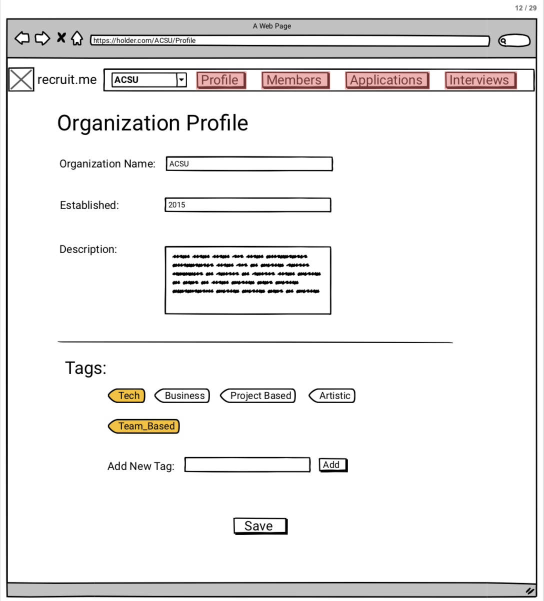
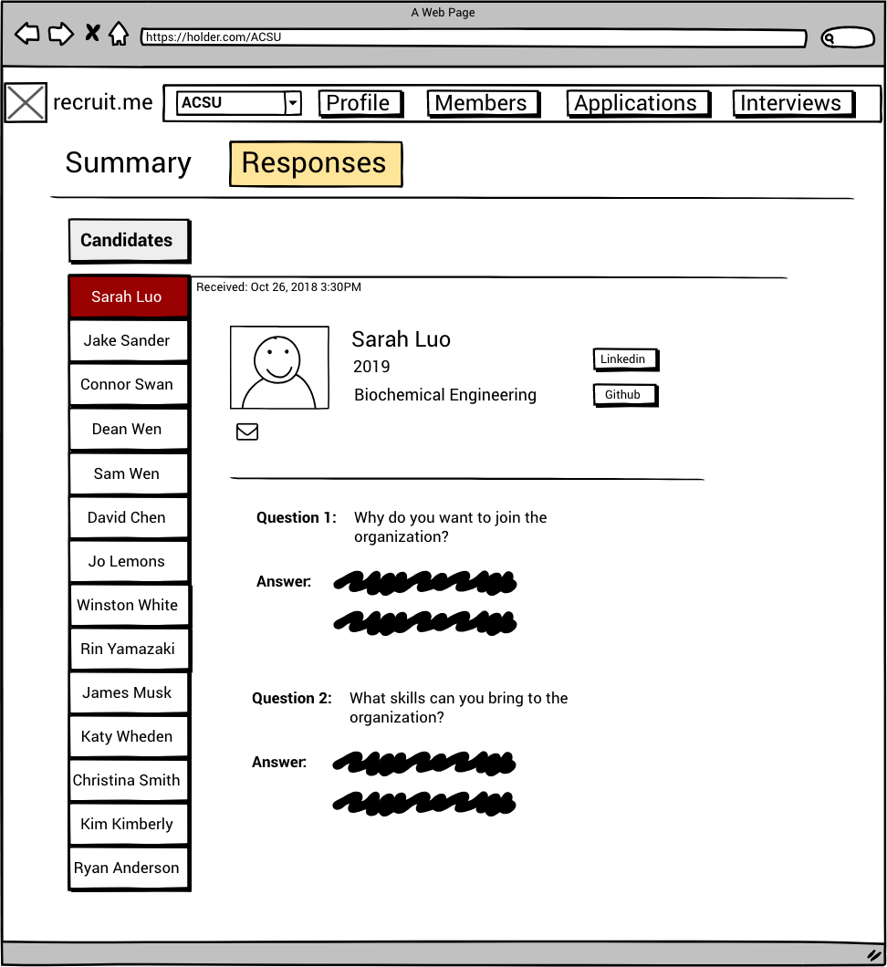
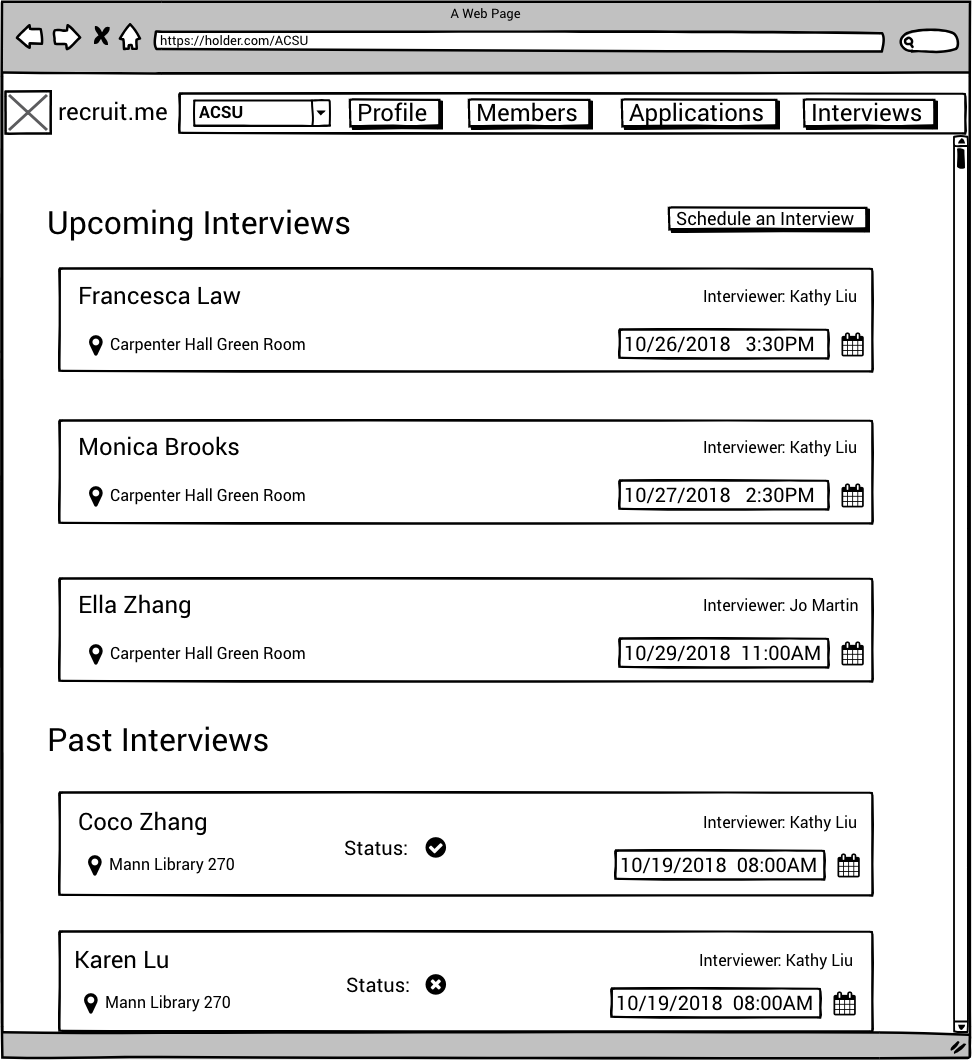
Through conducting user testing of our Balsamiq prototype, we received the following critiques:
- Users did not easily understand the function or purpose of the tags on the members page. They were confused about what those were referring to. Additionally, people confused these tags with those on the organization profile page.
- Users were not satisfied with the information being displayed on the profile page. They felt it was limiting and wouldn’t allow them to fully advertise their organization.
- Some users were confused about the members page because they were thinking about the app only through a recruitment lens, not realizing that it would also detail the already-existing members of the organization.
- Users were confused about whether they were successful in creating applications or not, which led us to include confirmation or error messages in future prototypes.
High-Fidelity Prototype with InVision
We created our final, high-fidelity prototype using InVision. You can interact directly with this prototype by clicking here.
We used the feedback from our user testing sessions to incorporate the following changes:
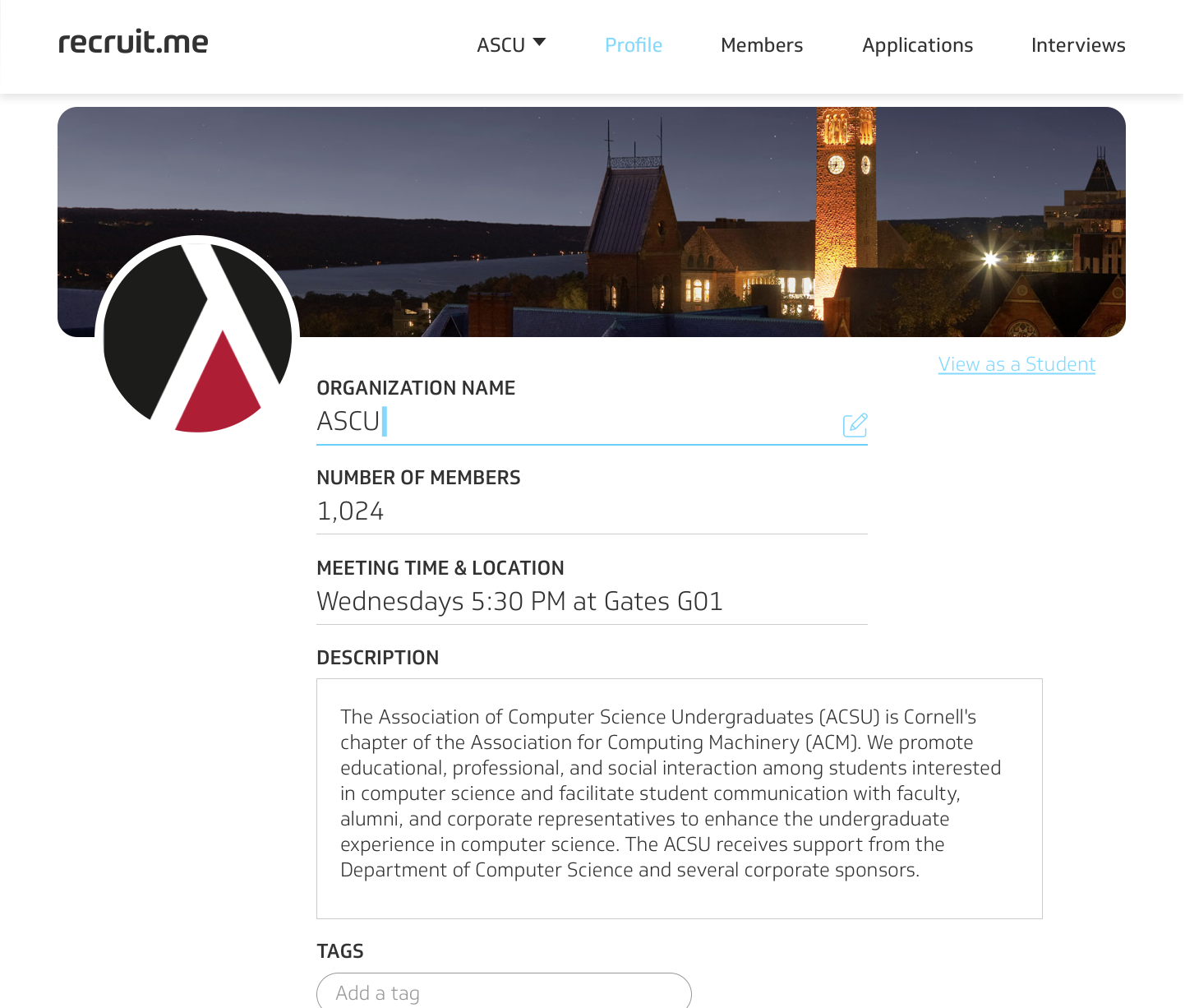
- The first improvement we made to our prototype was to the profile page. In our usability testing sessions, some of our participants seemed to be confused by elements on the profile page or what the profile page even was. In our old prototype, the page only had a few information fields (name, number of members, meeting times, and a short description) followed by the tag functionality. We improved upon this page by redesigning it so that it mimics more traditional profile pages found on social media sites; we added the ability for the organization to add both a profile and cover photo and enlarged the description text box so that users can write a more detailed description of their organization. This new design will help users to understand that this is a profile page for the organization.
- Something else that was mentioned in our testing sessions in regard to the profile page was that the tags were confusing. One of our participants stated that he had no idea what the tags were or how they worked. This meant that the tags were confusing in both concept and functionality, which led us to explore how we could make them more understandable. We decided that adding a small blurb next to the tags would help to explain their purpose.
- On the members page, we changed “Tags” to “Skills.” Users were getting confused by seeing the word “Tags” on both the profile and members pages, so we had to make a distinction between the two. There is also a small blurb that explains what skills are, similar to the one for tags on the profile page. Another small change we made to the page was to add the organization name in front of the word “members” so that users would understand that these are members of the organization and not just random people.
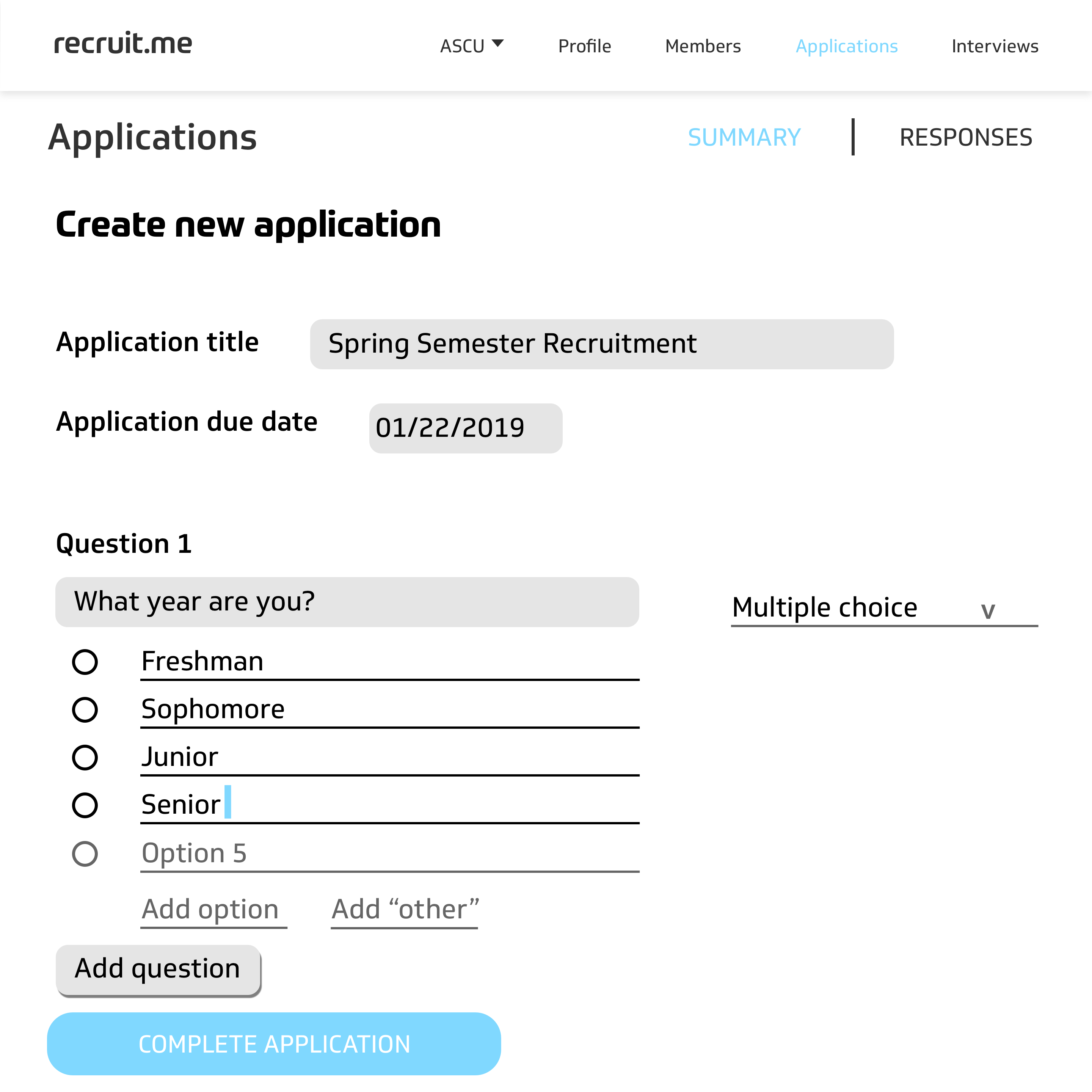
- Something our users were confused by during the process to make an application was that the website did not prompt the user that their application was created successfully. After clicking on “Complete Application,” the website would just stay on the same application creation page even though it was successfully created. The solution to this was fairly simple and effective: we added an “Application Created” confirmation screen so that the website was communicating effectively with the user.
Takeaways
This project gave me the most intensive use of all of my User Experience skills and also introduced me to new concepts and programs that are prevalent in the UX world. Specifically, I learned Nielsen’s heuristics and improved my skills with InVision and Balsamiq. The most important outcome from this project for me was learning the importance of iteration; we all believed that our initial ideas of how our project was going to turn out were good and ready, but going through multiple iterations of user testing and redesigning really taught me how important it is to be flexible and not stubborn when designing a product. Going through so many rounds of user testing also helped me learn how to carefully formulate questions and interviews so that you can get the best possible feedback out of your users. We started out by being too general and lazy with our questioning, but our later testing rounds showed a large improvement in interview results. Overall, I am very happy with how our design turned out and how I was able to grow because of it.